
Magento Community Edition (CE) 1.9 and Magento Enterprise Edition (EE) 1.14 Responsive Web Design Developer's Guide
by Erik Hansen
Contents
Introduction
Magento Enterprise Edition 1.14 and Magento Community Edition 1.9 come with a new theme named rwd that implements Responsive Web Design (RWD) practices. This guide discusses what you need to know when customizing your own responsive theme.
Magento CE's and EE's responsive theme uses a number of new technologies:
- Sass/Compass: A CSS pre-compiler that provides organizable, reusable CSS.
- jQuery: Used for all custom JavaScript in the responsive theme. jQuery operates in noConflict() mode so it doesn't conflict with Magento's existing JavaScript library.
- Additional JavaScript libraries discussed in more detail in Working With JavaScript.
If you're not familiar with Sass or Compass, you should familiarize yourself with them before continuing with this guide.
The new responsive theme code is contained in the following directories (relative to your Magento installation directory):
- app/design/frontend/rwd
- skin/frontend/rwd
See one of the following sections for more information:
Intended Audience
This guide assumes that you have a good understanding of Magento frontend development and Responsive Web Design techniques.
Documentation Conventions and Assumptions
This section discusses some basic information that applies to this guide.
Documentation Conventions
This guide uses the names custompackage and customtheme for the design package and theme. When you build your own responsive theme, use a more descriptive name, such as the name of your company.
The variable value [your Magento install dir] refers to the directory in which you installed Magento CE or EE. Typical values follow:
- Ubuntu: /var/www/magento
- CentOS: /var/www/html/magento
Assumption: How You Customize CSS
You have two choices to write your custom CSS styles:
- Write CSS in the Sass stylesheets using the same structure that the Magento responsive theme uses. This approach requires setting up a Compass compiler, but is strongly recommended. This guide assumes you'll use this approach.
- Directly modify the CSS files that ship with the responsive theme and ignore the Sass files. While this approach might be simpler in the short run, the CSS files in the responsive theme were output by the Sass compiler and are therefore not conducive to being customized directly. This approach is not recommended.
Exceptions to Responsive Web Design
Responsive design was not implemented for the following:
- Multiple address checkout
- Popular search terms page
- Popular search terms cloud
- Site map
- My Account—Billing Agreements
- My Account—Recurring Profiles
- E-mail templates
- Tags
- Polls
- Captcha
- The gift registry (EE only)
- Multiple wishlists (EE only)
- Place order by SKU (EE only)
 Note: Magento still supports other non-responsive themes as well. You don't need to use this guide to customize those themes. For more information, see the Designer's Guide to Magento.
Supported Devices and Browsers
Magento's responsive theme was developed with full support for the following devices and browsers:
- Windows:
- Internet Explorer 9 and later
- Latest stable version of Chrome
- Latest stable version of Firefox
- OS X:
- Latest stable version of Chrome
- Latest stable version of Firefox
- Latest stable version of Safari
- iOs (iPhone and iPad): Safari on iOs 7
- Android: Chrome browser on Android 4.0+ (also known as Ice Cream Sandwich)
Basic compatibility should be expected on Android 2.3+ (and other mobile devices) and Internet Explorer 8, but full support is not guaranteed.
Understanding the Changes in the Responsive Theme
The new responsive theme in EE 1.14 and CE 1.9 is based on the existing base/default theme. The new responsive theme has about 130 template files that have been modified to better handle the needs of responsive development. Following are some of the changes that have been made in these template files:
- Rearranged elements to work better with smaller viewports.
- Changed the Doctype to html to enable use of HTML5 elements. (To avoid large amounts of template modifications, HTML5 tags were implemented only when necessary.)
- Refactored attributes of <input> elements to HTML5 standards.
- Refactored product lists to show varying number of products per column.
- Removed all <fieldset> elements because they don't work well in a responsive context.
Changes to Layout Files
A number of the core layout files (catalog.xml, customer.xml) were slightly modified to account for responsive changes. There are only a few notable changes to the layout files:
- [your Magento install dir]/app/design/frontend/rwd/default/layout/page.xml was modified to include all of the new responsive assets.
- Because two and three column layouts collapse to a single column on smaller viewports, all content in the left block are displayed under the main content. This is a problem because blocks—like the navigation on all My Account pages—must display above the main content on smaller viewports. To address this, a new left_first block was added that looks like the left column on larger viewports, but on smaller viewports, it displays above the main content.
Using the New Theme/Layout Structure—Magento EE only
If you've worked with a previous version of Magento EE, you're aware that the enterprise/default theme contains copies of many of the layout and template files from base/default—some with very minor changes. This is not an optimal approach because as it results in duplicated content.
The Magento EE responsive theme's rwd/enterprise directory includes only template and layout files that contain Magento EE-only features.
Instead of copying layout files as the enterprise/default theme does, rwd/enterprise isolates changes in their own layout files in [your Magento install dir]app/design/frontend/rwd/enterprise/layout/enterprise
The rwd/enterprise theme replaces the enterprise/default theme and contains far fewer files than its predecessor (156 compared to 280). This new approach makes it easier for you to see what functionality is unique to Magento EE.
Changes to Magento Theme Fallback
Magento CE 1.9 and EE 1.14 both introduce a theme configuration file named theme.xml. This file allows theme developers to specify a parent theme which results in a more predictable and useful fallback than earlier versions.
For more information, see Alan Storm's Parent/Child Theme article.
Installing Compass and Sass
Sass is a powerful CSS pre-compiler that extends CSS supports variables, mixins, and placeholders. Compass is a library for Sass that adds hundreds of useful mixins and functions to Sass—everything from color blending to sprite generation.
Because the new Magento responsive theme uses the Compass library to compile its Sass files into CSS, you must install Compass in your development environment in any of the following ways:
- Command line
- Using any of the following third-party applications:
- Compile using your code editor (PhpStorm, Sublime, and so on): Many code editors run Compass from the editor so that you don't have to use the command line to re-compile when you make changes. However, you must install Compass using the command line.
Disabling the Magento Cache
A good practice during development on Magento is to disable Magento's cache. Although doing this adversely impacts performance, it frees you from having to manually clear the cache when you make changes to files or configuration settings that are being cached.
You should always enable the cache in a production environment.
To disable the cache:
- Log in to the Magento Admin Panel as an administrator.
- Click System > Configuration > Cache Management.
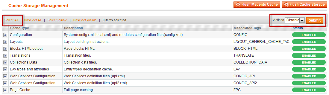
- On the Cache Management page, click Select All.
Note: The Page Cache option at the bottom of the list is available only in Magento EE. - From the Actions list in the upper right corner of the page, click Disable.
- Click Submit.
The following figure shows an example.
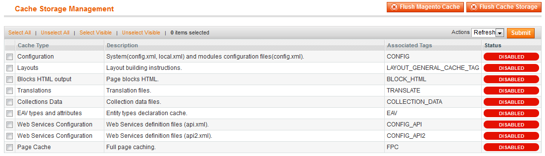
- Click Submit.
The following figures shows all cache types disabled.
Copying Files to Create Your Custom Theme
This section discusses how to start building a custom responsive theme.
See one of the following sections for more information:
- Step 1: Creating a Directory Structure for Your Responsive Theme
- Step 2: Copying Files For Your Theme
- Step 3: Configuring a Compass Watcher
- Step 4: Configuring Magento to Load Your Theme
- Step 5: Verifying Your Custom Theme
- Troubleshooting Theme Configuration
Step 1: Creating a Directory Structure for Your Responsive Theme
You'll do your responsive theme development using a copy of the responsive theme provided with Magento CE and EE. This section discusses how to create new top-level directories for your theme and to copy files to those directories.
The rwd/default theme falls back directly to the base/default theme, so themes in the default package will never be included as a part of the fallback chain.
Note: Magento EE only. The enterprise/default theme is completely replaced by rwd/enterprise and therefore, enterprise/default is not included as a part of the fallback chain.
The top-level directories you'll need are:
- [your Magento install dir]/app/design/frontend/custompackage/customtheme
- [your Magento install dir]/skin/frontend/custompackage/customtheme
To create those directories and to add your theme configuration:
- Using a command shell, log in to your Magento host as a user with privileges to write to the web server docroot. (Typically, this is the web server user.)
- Enter the following commands in the order shown:
cd [your Magento install dir]
mkdir -p app/design/frontend/custompackage/customtheme
mkdir -p skin/frontend/custompackage/customtheme
- Create another directory for your theme configuration and change to that directory:
mkdir app/design/frontend/custompackage/customtheme/etc
cd app/design/frontend/custompackage/customtheme/etc
- Use vim or another text editor to create your theme configuration file named theme.xml
there:
vim theme.xml
- theme.xml must have different contents for Magento CE or Magento EE:
- Magento CE:
<?xml version="1.0"?> <theme> <parent>rwd/default</parent> </theme> - Magento EE:
<?xml version="1.0"?>
<theme>
    <parent>rwd/enterprise</parent>
</theme>
 Important: It's very important you have a theme.xml in the app/design/frontend/custompackage/customtheme/etc directory with exactly the contents shown. Failure to configure theme.xml correctly prevents Magento from loading your theme.
- Magento CE:
Step 2: Copying Files For Your Theme
Use the following commands to copy files for your custom theme:
cd [your Magento install dir]
cp -R skin/frontend/rwd/default/images skin/frontend/custompackage/customtheme
cp -R skin/frontend/rwd/default/scss skin/frontend/custompackage/customtheme
Copying the images directory is important because the CSS uses relative image paths. To avoid duplicating Sass files, review the information discussed in Sass Fallback Structure.
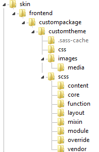
The following figure shows how your custom theme directory structure looks after copying these files and directories.
Step 3: Configuring a Compass Watcher
You can configure Compass to watch your skin directories for changes to CSS and JavaScript and to compile them when something changes.
You can do this in either of the following ways:
- (Recommended) Using your PHP IDE. For example, if you use PhpStorm, see Working with Sass and SCSS in Compass Projects and Using File Watchers.
- Using following commands:
cd [your Magento install dir]/custom-theme-dir/scss
compass watch .
For example, if Magento is installed in /var/www/html/magento, enter:cd /var/www/html/magento/skin/frontend/custompackage/customtheme/scss compass watch .
For more information, see Compass Command Line Documentation.
Success Messages
Messages similar to the following display to indicate the command completed successfully:
>>> Change detected at 09:57:12 to: madisonisland-ie8.scss
   create ./../css/madisonisland-ie8.css
   create ./../css/styles.css
   create ./../css/madisonisland.css
   create ./../css/styles-ie8.css
   create ./../css/scaffold-forms.css
>>> Compass is polling for changes. Press Ctrl-C to Stop.
Failure Message
If the following message displays, it likely indicates that config.rb is not in the correct location:
Nothing to compile. If you're trying to start a new project, you have left off the directory argument.
Enter the following commands to verify you have config.rb in the correct location:
cd [your Magento install dir]
ls skin/frontend/custompackage/customtheme/scss
If there is no config.rb in that location, enter the following command:
cp skin/frontend/rwd/default/scss/config.rb skin/frontend/custompackage/customtheme/scss
Compass requires a config.rb file located in the directory from which you run this command. The sample provided with Magento CE and EE follows:
# note: this should never truly be referenced since we are using relative assets
http_path = "/skin/frontend/rwd/default/"
css_dir = "../css"
sass_dir = "../scss"
images_dir = "../images"
javascripts_dir = "../js"
relative_assets = true

output_style = :expanded
environment = :production
After correcting the issue, try the compass watch commands discussed in Step 3: Configuring a Compass Watcher.
Step 4: Configuring Magento to Load Your Theme
This section discusses how to configure Magento to load your new theme.
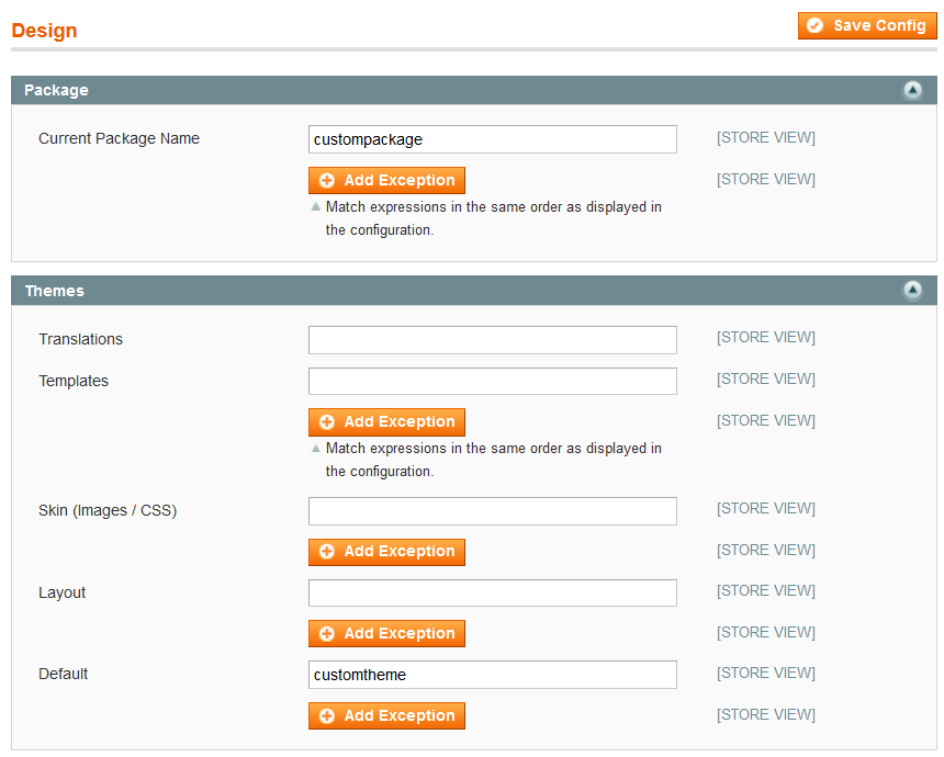
- Log in to the Magento Admin Panel as an administrator.
- Click System > Configuration > GENERAL > Design.
- In the right pane, click Package to expand it.
- In the Current Package Name field, enter custompackage
- In the right pane, expand Themes.
- In the Default field, enter customtheme
The following figure shows an example.
- In the top right corner of the page, click Save Config.
If an error displays when you attempt to save the configuration, see Troubleshooting Theme Configuration. - If prompted, flush the cache:
- Click System > Configuration > Cache Management.
- At the top of the page, click Flush Magento Cache.
Step 5: Verifying Your Custom Theme
To verify that Magento loads your theme:
- Navigate to your web store in a web browser.
- View the web page source.
- If you see a reference to /skin/frontend/custompackage/customtheme/css/styles.css, you are ready to begin building your new theme.
Note: If your theme fails to load properly, see the next section.
Troubleshooting Theme Configuration
See one of the following sections for troubleshooting assistance:
General Troubleshooting
The following sections assist you in determining the cause of errors you might experience after setting up your custom theme.
No formatting on the web store
Description: Most likely an issue with theme.xml. You can confirm this by viewing the page source and searching for styles.css. If styles.css is loading from a path similar to the following, theme.xml is most likely not loading.
http://www.example.com/magento/skin/frontend/base/default/css/styles.css
Solution: Enter the following command:
cat [your Magento install dir]/app/design/frontend/custompackage/customtheme/etc/theme.xml
If the error No such file or directory displays, check your directory paths and create theme.xml as discussed in Step 2: Copying Files For Your Theme.
If you have a theme.xml, check to make sure it's configured exactly as shown here.
Error saving the custom package and theme in the Admin Panel
Symptom: The following error displays:
An error occurred while saving this configuration: package with this name does not exist and cannot be set.
Description: The package and theme names you entered in the Admin Panel must be directories in a specific location on the file system. These directories don't exist. (See the figure in Directory and File Reference.) Check the path and spelling.
Solution: Repeat the tasks discussed in Step 1: Creating a Directory Structure for Your Responsive Theme.
Wrong formatting in the web store
Symptom: Examples:
- No images display
- Only a list of categories displays on the left side of the page, with images after the text
Description: There is a different theme.xml for CE and EE. You might have used an EE theme.xml with CE or vice versa.
You can verify this using a web browser inspector:
- styles.css loads from the correct directory
- Some HTTP 403 (Forbidden) errors loading images
- Some HTTP 404 (Not Found) errors loading images from skin/frontend/base/default/images/media (which doesn't exist)
Solution: Review the information discussed in Step 2: Copying Files For Your Theme.
Make sure theme.xml for CE or EE is configured exactly as shown here.
Directory and File Reference
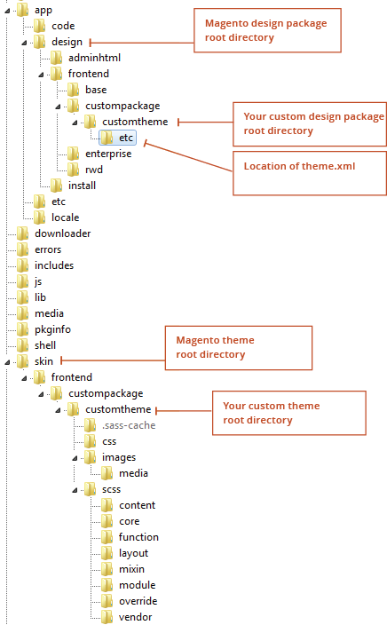
The following figure shows the directory structure in a properly configured system, as well as the location of theme.xml, the custom theme configuration file.
Responsive Theme Reference
This section discusses information you need to customize the responsive theme you started in Copying Files to Create Your Custom Theme.
See one of the following sections for more information:
- Basic Recommendations for Development
- Understanding the Sass Structure
- Adding Your Own Sass Partials
- Using Media Query Breakpoints
- Working With Images
- Working With JavaScript
Basic Recommendations for Development
We recommend you do the following things when you start developing your responsive theme:
- Edit [your Magento install dir]/skin/frontend/custompackage/customtheme/scss/config.rb to change
environment = :production to environment = :development.
For more information about this setting, see Compass Configuration Reference. - Disable the Magento cache as discussed in Disabling Magento's Cache.
Understanding the Sass Structure
In previous versions of Magento, all CSS styles were grouped into a massive styles.css file that was cumbersome and difficult to navigate. The CSS in the responsive theme is organized into individual files referred to as Sass partials.
When Compass compiles the Sass partials, the output is a set of CSS files that are loaded by the browser: styles-ie8.css is for Internet Explorer 8 and earlier, and styles.css is for all other browsers.
Following is the directory structure of the skin/frontend/custompackage/customtheme directory.
Note: This structure does not include the sample data assets that you will remove later in this guide.├── css │ ├── scaffold-forms.css │ ├── styles-ie8.css │ └── styles.css ├── images │ ├── ajax-loader.gif │ ├── bg_x.png │ ├── demo-logo.png │ ├── demo_logo.png │ ├── icon_sprite.png │ ├── [email protected] │ ├── logo.png │ ├── logo_small.png │ ├── opc-ajax-loader.gif │ ├── social_icons.png │ └── [email protected] └── scss ├── _core.scss ├── _framework.scss ├── _var.scss ├── config.rb ├── content │ ├── _category.scss │ ├── _home.scss ├── core │ ├── _common.scss │ ├── _form.scss │ ├── _reset.scss │ └── _table.scss ├── function │ ├── _black.scss │ └── _white.scss ├── layout │ ├── _footer.scss │ ├── _global.scss │ ├── _header-account.scss │ ├── _header-cart.scss │ ├── _header-nav.scss │ ├── _header-search.scss │ └── _header.scss ├── mixin │ ├── _breakpoint.scss │ ├── _clearfix.scss │ ├── _if-resolution.scss │ ├── _image-replacement.scss │ ├── _loading-overlay.scss │ ├── _menu.scss │ ├── _not-selectable.scss │ ├── _toggle-content.scss │ ├── _triangle.scss │ └── _typography.scss ├── module │ ├── _account-reviews.scss │ ├── _catalog-compare.scss │ ├── _catalog-msrp.scss │ ├── _catalog-product.scss │ ├── _checkout-cart-minicart.scss │ ├── _checkout-cart.scss │ ├── _checkout-onepage.scss │ ├── _checkout-success.scss │ ├── _cms.scss │ ├── _configurableswatches.scss │ ├── _contacts.scss │ ├── _cookies.scss │ ├── _customer.scss │ ├── _paypal.scss │ ├── _pricing_conditions.scss │ ├── _product-list.scss │ ├── _review.scss │ ├── _search.scss │ ├── _slideshow.scss │ └── _wishlist.scss ├── override │ └── _plugin.scss ├── scaffold-forms.scss ├── styles-ie8.scss ├── styles.scss └── vendor └── _normalize.scss
This is an explanation of the files in the preceding list:
- config.rb: Configuration values that tell Compass to look in the scss directory for Sass files and to export the CSS to the css directory. It also includes information about how Compass should format the compiled CSS.
- scss/styles.scss: Wrapper that imports the framework.scss and core.scss files.
- scss/styles-ie8.scss: Identical to styles.css file, except it does not include any media queries because Internet Explorer 8 and earlier don't support media queries. For more information, see Using the bp() mixin for older Internet Explorer Browser Versions.
- scss/_framework.scss: Imports all of the libraries, variables, functions, and mixins used by the
other stylesheets. The files imported by framework.scss do not output any CSS on their own. Because
of that, this file can be imported by other Sass files that are intended to compile directly to CSS
files.
For example, in Magento EE, the skin/frontend/rwd/enterprise/scss/enterprise.scss file imports skin/frontend/rwd/default/scss/_framework.scss so the Magento EE partials can use the common variables, mixins, and so on imported by framework.scss.- scss/_var.scss: Contains variables like breakpoints, spacing, colors, and font styles that are used by the other Sass partials. You should expect to modify this file heavily as you customize your responsive theme.
- scss/mixins/: This directory contains all of the mixins used by the responsive theme. You should familiarize yourself with these mixins because they are useful for writing your custom styles.
- scss/function/: This directory contains functions that the responsive theme uses. Functions are mixins that return simple values.
- scss/_core.scss: Imports all of the Sass partials that output CSS content:
- scss/core/: Partials that contain all of the global styles. Expect to heavily customize the partials in this directory.
- scss/layout/: Partials that define the structural layout of the responsive theme (header, content, and footer). The scss/core/_common.scss partial also contains some layout styles—specifically the one, two, or three column layouts.
- scss/module/: Partials that contain styles grouped by module. While the correlation between these module files and Magento core modules is close, it is not a 1:1 relationship. For example, the _product-list.scss file contains styles for both the Mage_Catalog and Mage_CatalogSearch modules.
- scss/vendor/: This directory is intended for third-party CSS libraries like the _normalize.scss partial that normalizes how browsers render elements.
- scss/scaffold-forms.scss: For more information, see Scaffold Forms.
Adding Your Own Sass Partials
To customize styles for an existing Magento theme, you should edit existing Sass partials. However, if you are building a highly custom theme, you will likely want to create new partial files to contain styles for new functionality that you are introducing. Here is how to do that:
- Add your partials to a new file named skin/frontend/custompackage/customtheme/scss/module/_new-module.scss.
- Create a new skin/frontend/custompackage/customtheme/scss/_custom_core.scss file with the following
line to import your new partial:
@import "module/new-module";
Note: Although you could edit core.scss to import your new partials, you should create _custom_core.scss to clearly distinguish which partial files are custom versus native. - Add this line to the bottom of styles.scss and styles-ie8.scss files:
@import "custom_core";
The contents of your new Sass partial will now be included in the output CSS files.
Using Media Query Breakpoints
The responsive theme has a set of breakpoints it uses consistently (except for a few one-off breakpoints). These breakpoints are defined in both _var.scss and app.js so the CSS and JavaScript functionality stay in sync:
$bp-xsmall: 479px;
$bp-small: 599px;
$bp-medium: 770px;
$bp-large: 979px;
$bp-xlarge: 1199px;
A custom bp() mixin includes media query breakpoints.
For example, this Sass:
@include bp(max-width, $bp-medium) {
    /* These styles will only display on viewports smaller than or equal to 770px */
}
@include bp(min-width, $bp-medium+1) {
    /* These styles will only display on viewports larger than or equal to 771px (770px + 1px) */
}
generates this CSS:
@media only screen and (max-width: 770px) {
    /* These styles will only display on viewports smaller than or equal to 770px */
}
@media only screen and (min-width: 771px) {
    /* These styles will only display on viewports larger than or equal to 771px (770px + 1px) */
}
The breakpoint variables are intended to be used with max-width by default. When you use the breakpoint with min-width, you should add a pixel ($bp-medium+1) so the min-width and max-width styles don't both get applied to the same viewport size.
Using the bp() mixin for older Internet Explorer Browser Versions
It is important to use the bp() mixin for your media query breakpoints because Internet Explorer 8 and earlier do not support media queries. While you can use a polyfill like respond.js to add media query support to IE versions 6–8, doing so will impact performance. Additionally, using a polyfill doesn't add much value because nearly all IE 6–8 users view web pages on a large screen device (1024px or larger), so those users won't benefit from media queries anyway.
To address the fact that IE 6–8 doesn't support media queries, the styles-ie8.scss stylesheet defines a couple of variables:
$mq-support: false;
$mq-fixed-value: 1024px;
With those variables defined, the bp() mixin outputs only the styles that would be visible on a 1024px+ viewport and it does not wrap those styles in a media query so that the IE browsers always render those styles. Refer to _breakpoint.scss to see exactly how this is done.
While it is acceptable to use the breakpoint variables defined by the responsive theme, when building your own responsive theme, your breakpoints should be specifically tailored to the content of your site. For example, let's say your main navigation only has four links and it fits nicely in a horizontal layout on viewports larger than 400px.
The responsive theme changes the horizontal layout to a collapsed drop-down on viewports smaller than 771px. Rather than defaulting to how the theme collapses the navigation, you should change the navigation to break at about 400px so users on screens between 400px and 771px get to experience the benefit of viewing the horizontal navigation.
Working With Images
There are very few images in the responsive theme compared to the other Magento themes because CSS3 is used whenever possible to accomplish a visual effect.
Working With the Header Logo
The responsive theme enables you to specify two different logos: one optimized for small screens (narrower than 770px) and the other for large screens. Place your two logo files in skin/frontend/custompackage/customtheme/images and specify the path to both logos in the Magento Admin Panel:
- Log in to the Magento Admin Panel as an administrator.
- Click System > Configuration > GENERAL > Design.
- In the right pane, click Header to expand it.
- In the Logo Image Src field, enter the path of your primary logo. For example: images/logo.png.
- In the Small Logo Image Src field, enter the path of your logo for small viewports. For example: images/logo_small.png.
- In the top right corner of the page, click Save Config.
- If prompted, flush the cache:
- Click System > Configuration > Cache Management.
- At the top of the page, click Flush Magento Cache.
Working With Sprites
The responsive theme uses two sprites: one for general icons and the other for social icons.
Both sprite images output at 1x and 2x resolutions (for high-resolution screens). Because sprite files are very difficult to edit without the source files, you should use these Photoshop files to change these sprites: RWD_icon_sprite.psd and RWD_social_icons.psd
Compass provides support for generating sprites from individual image files, but it was not used to generate sprites for the responsive theme. However, you might want to take advantage of that feature for your custom theme. Using this method requires knowledge of Compass.
Working With JavaScript
All of the custom JavaScript in the responsive theme is contained in skin/frontend/rwd/default/js/app.js. To customize the responsive theme's JavaScript, copy app.js to skin/frontend/custompackage/customtheme/js and edit it there.
All custom JavaScript is based on jQuery (v1.10.2). In addition to jQuery, the following JavaScript libraries are included in the responsive theme:
- enquire.js: Used to run JavaScript conditionally, based on viewport size.
- imagesloaded.js: Used to determine whether images are fully loaded on the product detail page before activating zoom.
- jquery.cycle2.min.js: Powers the rotating banners on the homepage (requires Magento's sample data). This library can be removed if you aren't using the sample data. If you want to implement slide shows, Owl Carousel is recommended over Cycle2, as it has true swipe support and has more options.
- jquery.cycle2.swipe.min.js: Adds pseudo-swipe support to Cycle2.
- jquery-1.10.2.min.js: jQuery library
- matchMedia.js and matchMedia.addListener.js: Used by enquire.js to provide support for Internet Explorer 9.
- modernizr.custom.min.js: Adds classes to the <html> tag to indicate whether browser supports certain CSS3 features and whether device is touch-enabled. The .touch and .no-touch classes are used in the Sass partials. They provide a Modernizr.mq function to test a media query in a cross-browser manner.
- selectivizr.js: Adds support for CSS3 selectors in IE 6–8
- elevatezoom/jquery.elevateZoom-3.0.8.min.js: Powers image zoom on product detail pages.
Removing Sample Data Assets
The responsive theme includes several assets that are intended to power Magento's sample data. We recommend you remove them before you build your custom theme.
- Remove the following files and directories:
skin/frontend/custompackage/customtheme/images/media
skin/frontend/custompackage/customtheme/scss/madisonisland.scss
skin/frontend/custompackage/customtheme/scss/madisonisland-ie8.scss
skin/frontend/custompackage/customtheme/scss/content/_category.scss
skin/frontend/custompackage/customtheme/scss/content/_home.scss
skin/frontend/custompackage/customtheme/css/madisonisland.css
skin/frontend/custompackage/customtheme/css/madisonisland-ie8.css
- In your custom layout file (for example,
app/design/frontend/custompackage/customtheme/layout/local.xml), add this XML:
<layout version="0.1.0"> <default> <reference name="head"> <action method="removeItem"><type>skin_js</type><name>js/slideshow.js</name></action> <action method="removeItem"><type>skin_js</type><name>js/lib/jquery.cycle2.min.js</name></action> <action method="removeItem"><type>skin_js</type><name>js/lib/jquery.cycle2.swipe.min.js</name></action> <action method="removeItem"><type>skin_css</type><name>css/madisonisland.css</name></action> <action method="removeItem"><type>skin_css</type><name>css/madisonisland-ie8.css</name></action> <action method="removeItem"><type>link_rel</type><name>//fonts.googleapis.com/css?family=Raleway:300,400,500,700,600</name></action> </reference> </default> </layout>- Removes the Madison Island CSS files
- Removes the Raleway font that is used as a part of the default theme
- Removes the jQuery Cycle plugin and the slideshow.js file that activates Cycle.
- Update this line in skin/frontend/custompackage/customtheme/scss/_var.scss to reference whatever
font you want to use for your custom site font:
$f-stack-special: 'Raleway', 'Helvetica Neue', Verdana, Arial, sans-serif;
If you want to use a custom web font for your theme (such as a Google Font, add XML like this to the <reference name="head"> section of layout.xml (see step 3). Customize the <href> value to the value that your custom web font provider gives you. It is recommended to include the same font weights that are referenced below (300,400,500,700,600) because the responsive theme uses each of those font weights.
<action method="addLinkRel"><rel>stylesheet</rel><href>//fonts.googleapis.com/css?family=Raleway:300,400,500,700,600</href></action>
Advanced Topics
After you get familiar with the new structure, we encourage you to read these topics to fully take advantage of responsive web design.
Getting Your Theme Ready for Production
To prepare your responsive theme for production, you should update config.rb in your theme directory to use these values:
output_style = :compressed
environment = :production
After you do this, you should recompile all of your Sass files—you can do this on the command line by running these commands inside your theme directory: compass clean and then compass compile. Finally, deploy the compiled CSS to your production system.
Sass Fallback Structure
We recommend copying all of the Sass files from skin/frontend/rwd/default/scss to skin/frontend/custompackage/customtheme/scss to make it easy to get started with custom theme development. The downside of this approach is that it results in duplicating many files that you never edit directly.
In the end, your custom theme must include all Sass partials you want to override. There are at least two ways to do this:
- If you followed the setup instructions in Step 1: Creating a Directory Structure
for Your Responsive Theme, you must delete some files from your custom theme.
Delete the following directories to remove all the Sass partials that you copied from rwd/default:
skin/frontend/custompackage/customtheme/scss/core/
skin/frontend/custompackage/customtheme/scss/function/
skin/frontend/custompackage/customtheme/scss/layout/
skin/frontend/custompackage/customtheme/scss/mixin/
skin/frontend/custompackage/customtheme/scss/module/
skin/frontend/custompackage/customtheme/scss/override/
skin/frontend/custompackage/customtheme/scss/vendor/
The following files should now be located in skin/frontend/custompackage/customtheme/scss:
_var.scss
_core.scss
styles-ie8.scss
styles.scss
scaffold-forms.scss
_custom_core.scss
_framework.scss
- If you're familiar with Magento theme development and you did not already copy Sass partials, copy only the Sass partials you want to override from rwd/default to skin/frontend/custompackage/customtheme/scss.
Now you can set up a fallback structure:
- Add the following line to skin/frontend/rwd/default/config.rb (omit the first line if you're using
CE):
add_import_path "../../../rwd/enterprise/scss"
add_import_path "../../../rwd/default/scss"
The preceding causes Compass to look for Sass files in skin/frontend/rwd/enterprise/scss first and then in skin/frontend/rwd/default/scss if they can't be found in skin/frontend/custompackage/customtheme/scss. - Following is what to do with copies of Sass files from rwd/default:
- styles.scss, styles-ie8.scss: You must copy these files into your custom theme so that Compass knows which files to compile into CSS files.
- _core.scss, framework.scss: You must copy these files into your custom theme so Compass looks in the custompackage/customtheme directory for any of the files imported by these two files.
- _var.scss: You'll typically edit the values in this file for your custom theme.
If you don't like the idea of editing this file and want to override its values with a _var_custom.scss file, make sure it gets imported immediately after _var.scss.
- As a reminder, to override Sass partials in rwd/default, you must copy them into your custom theme
so they'll get included by Compass.
Note: If you're using compass watch to recompile your Sass, you must stop and restart Compass any time you copy a new Sass file into your custom theme. Otherwise, the Compass compiler won't know about the existence of the new file.
To avoid having to stop and restart compass watch, start your project by copying all Sass files from rwd/default into your custom theme, and then delete all unchanged Sass files at the end of your project.
Scaffold Forms
The Magento responsive theme ships with skin/frontend/rwd/default/scss/scaffold-forms.scss that has styles that cause the labels of long forms (for example, the Billing Information step of checkout) to display to the left of their associated input on larger viewports (as opposed to on top). This layout is intended to make long forms seem less intimidating to users.
However, these styles are not currently implemented because the Magento responsive theme must work well with internationalization (where the length of labels can vary greatly, thereby impacting the scaffold form layout).
It's up to you whether or not to use these styles. To do so, move skin/frontend/rwd/default/scss/scaffold-forms.scss to core/_scaffold-forms.scss and edit scss/_core.scss to include it.
High-Definition Images
The responsive theme has no high-resolution image solution for product listing pages. Refer to slides starting at 114 of Brendan Falkowski's Imagine 2013 talk for implementation suggestions. For a 2x solution, PictureFill (or similar polyfill) could be used, although it would need to be integrated with ElevateZoom.
Note: Category banners and product detail pages use a 1.5x image solution.
Magento does not resize the main product photo on product detail pages, so you must implement high-resolution support in your responsive theme. You must be careful with this if you have very large product photos because it could drastically impact performance.
To constrain the size of your main product photo, open app/design/frontend/rwd/default/template/catalog/product/view/media.phtml and modify this line:
<?php echo $this->helper('catalog/image')->init($_product, 'image') ?>
to something like:
src="<?php echo $this->helper('catalog/image')->init($_product, 'image')->constrainOnly(true)->resize(1800); ?>"
Getting Help With Your Theme
If you encounter issues building a custom responsive theme, you can post your question on the community magento.stackexchange.com site and tag it with rwd-theme.
To browse the list of questions, see http://magento.stackexchange.com/questions/tagged/rwd-theme.